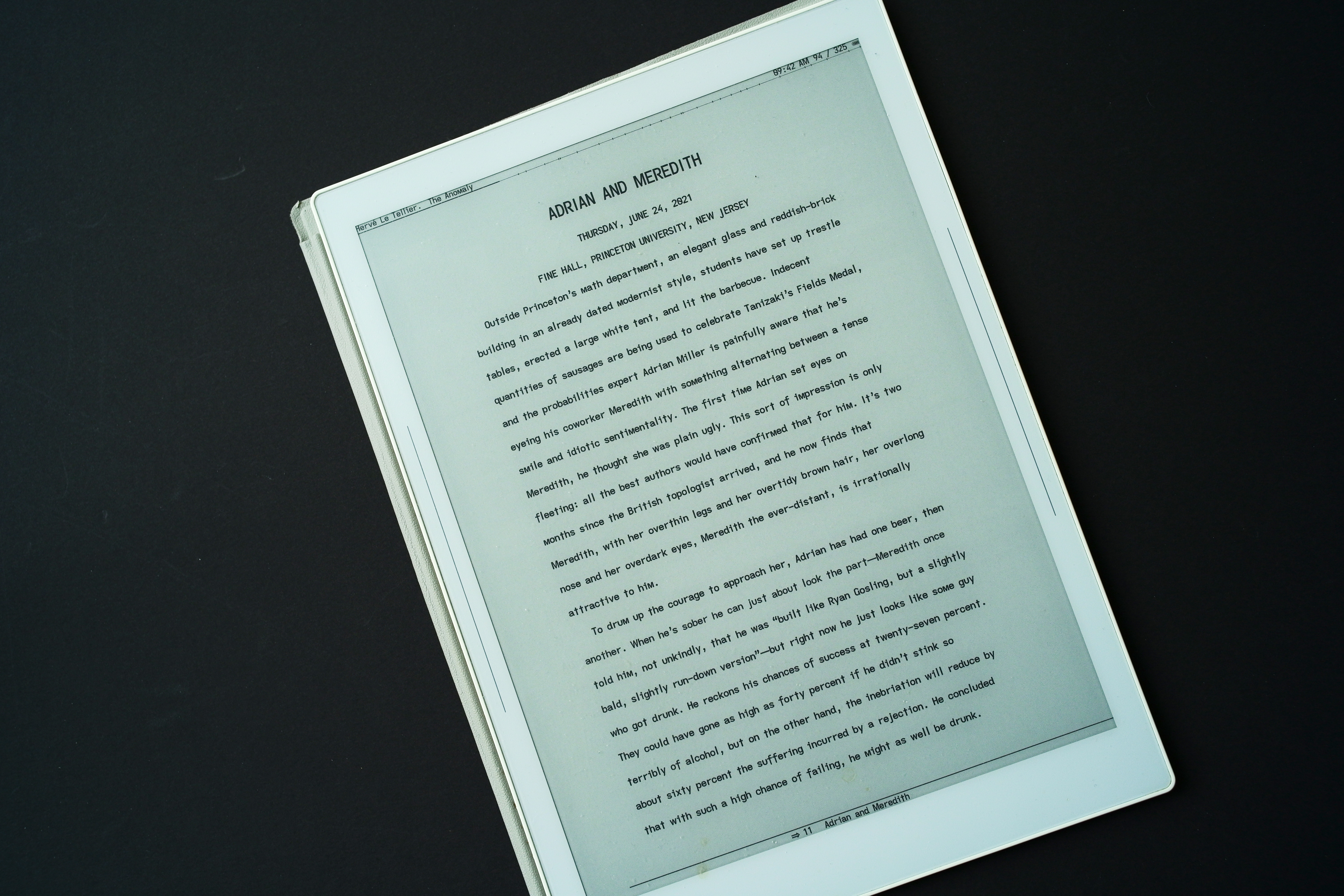
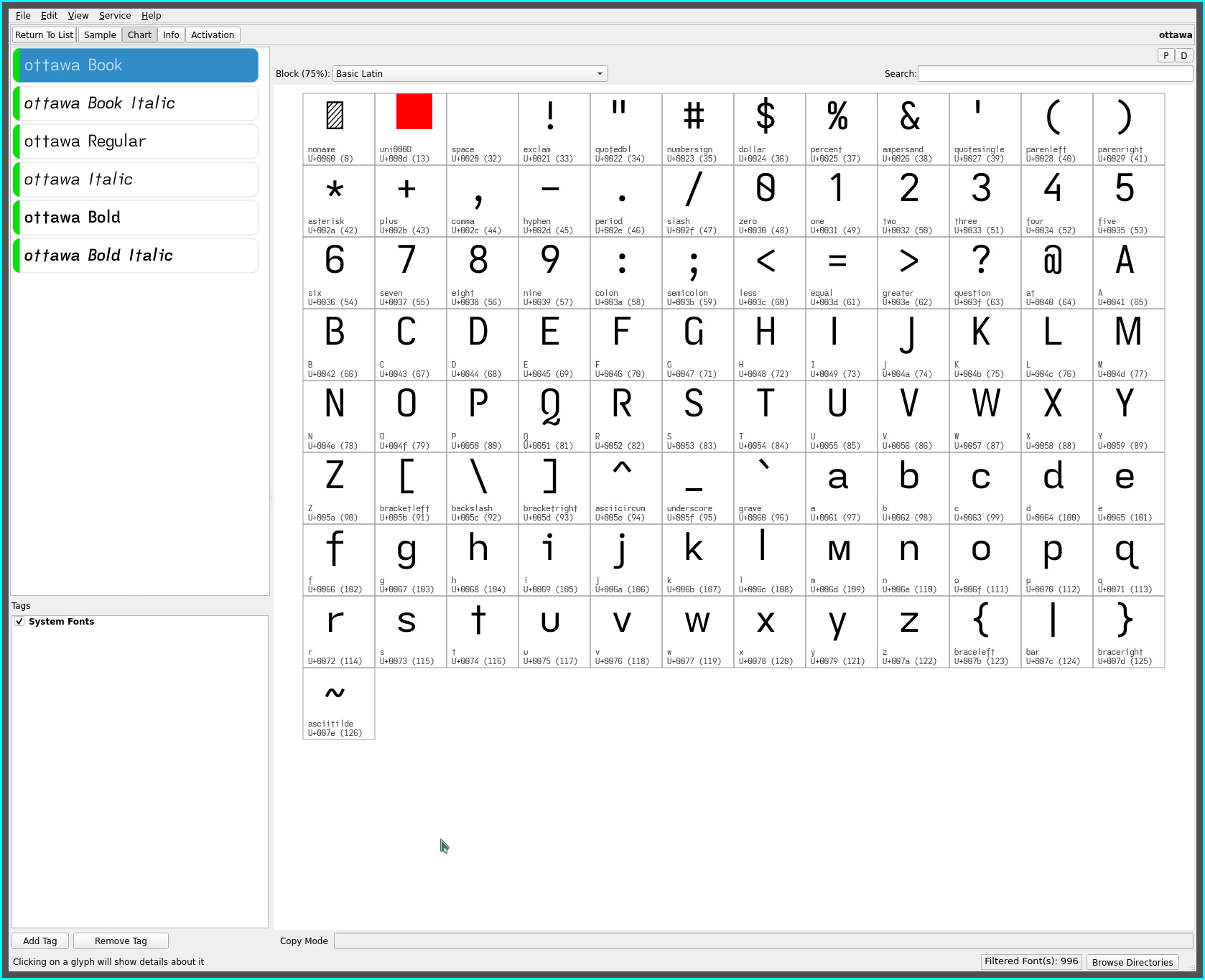
ottawa font
the ottawa font follows on the heels of the gotham font. It couldn’t be helped -:)

Whereas, the gotham font has a very clean, linear architectural feel (with minimal descenders visually accentuating the horizontal baseline and a Futura like leanness), the ottawa font re-introduces the cross t descender (though much more subtly than the singspiel font) and extended f..

The descender of the extended f is reduced from the original y descender depth—the traditional depth when this glyph is extended. While the gotham font attempts more traditional profile, the descenders of the ottawa font visually balances its extended cap height, providing a less accented, yet naturally proportioned glyph shape to the remainder of the glyph set.
Whereas the singspiel font presents a visual rhythmic cadence with its prominent lower case f and t descenders, the ottawa font’s emphasis leans towards a more organic presentation. The upward flare of ottawa’s less accentuated descending t (and f), adjacent to other descending glyphs, goes largely unnoticed (despite their frequency), instead, adding a graceful visual rising line. The return of the straight-turned lower case y further adds to the organic effect.
The font has a pleasing rendering, though, gotham’s leaner horizontal presentation should feel more familiar for most. i happen to like both these fonts and, so far, have be leaning towards this variant for its character and readability—despite the original oddity of the descending t in its introduction with the singspiel font, it does render more legibly (and is vastly more subtle with its shortened descender)..
As always, YMMV.
nagoya font
To complete the straight m font set, the nagoya font re-introduces the asymmetric t..

It has been awhile since the asymmetric t dominated my ereading pleasure but i am sure it will find it’s way back into my font rotation :-) The nagoya font combines all the most radical glyph approaches made on this site for an even more distinctly unique typeface, while being true to its dyslexic approach.
repos
This font may be found on OneDrive.